Orientation systems help people find their way around unfamiliar places.
Because being able to orient oneself well is very important for personal well-being. The mere thought of getting “lost” or not finding the destination means distraction, bad mood, stress and uncertainty.
In other words, feelings that not only severely impact the visitor experience, but also safety.
Whether it’s an airport, shopping center, hotel or office building, well thought-out orientation systems are a must!
Everyone needs good orientation! But nevertheless, people in old age, for example, have different requirements for orientation systems than younger people. In addition, there are many different types of visual impairment that also make good orientation difficult.
Orientation systems should therefore be as barrier-free as possible.
Why not make accessibility a benchmark right away? Then top orientation for all visitors is guaranteed!
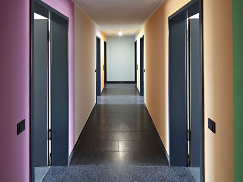
The right color scheme helps people to recognize their surroundings. And to be able to move around safely. Even if their vision is poor.
Strong contrasts in brightness, for example, are extremely important. They help people to recognize doors, stairs, furniture and room dimensions. So it makes sense to get advice on standards for barrier-free color design and chic solutions.
Our tip: Brillux, which are considered experts in orientation with colors. And offer interested parties many great publications and even seminars. To the Brillux website

Room boundaries, doors and switches are easily recognizable. And it looks very stylish. Photo: @ Brillux
Sure, polished metal, shiny marble and sparkling glass fronts look very elegant and classy.
But for orientation, they are a challenge. Especially for people with visual impairments. Strong reflections dazzle and reduce the all-important contrasts.
Then there’s a need for good orientation systems:

Stoneware from Agrob Buchtal: matte, textured tiles can look this classy. Photo: @Agrob Buchtal
Orientation systems always include guidance systems, i.e. – signs and directional arrows. Of course, these orientation aids must be mounted in the right places. And have good contrast and font size.
But for all people who cannot read them, these signs are useless. (Functional) illiterates, cognitively impaired, people with reading difficulties, blind and severely visually impaired people: For all of them, accessible orientation systems still need additional measures.
Some examples are:
Our tip: A lot of know-how about barrier-free orientation systems and quality “made in Germany” is available from the company Moedel.
Pros & Cons of Braille, tactile lettering and Audio Format
read moreKornelia Grundmann, arhitect and judicially certified expert, answers questions about barrier-free building and how to…
read moreWhy the generation 50+ is such an important target group
read moreWhy accessibility provides user-friendliness for ALL customers!
read moreFunctional illiteracy affects around 100 million people in the EU. Why is this a problem? And what solutions are…
read moreWhich aids for visual impairment are suitable for the elderly:
read moreRead the latest SpeechCode blogs and news on the topics Universal Design, Customer Focus and Digitalisation.
read more